
Building a Corn Disease Risk Dashboard
Introducing a new open-source dashboard tracking daily risk for tar spot, ear rots, southern rust, and mycotoxins across three experimental sites
The Story Behind My Corn Disease Risk Dashboard: How I Automated Five Published Corn Disease Models for Wisconsin
For the last several months I’ve been quietly building as part of my pet projects, a corn disease risk dashboard at corn-dashboard on this site. It’s live now and refreshes daily. This blog post is the story of how it came together: what I learned about my own field by writing it down in code, and what I learned about software engineering by trying to make it work.
I’m a postdoc at the US Dairy Forage Research Center in Madison, Wisconsin. Last year (2025), while scouting for corn diseases and collecting data for our mycotoxin predictive modeling project, I found myself standing in fields completely overwhelmed by a massive southern rust epidemic. The outbreak moved so fast in the Midwest that in October 2025, Professor Gbola (Adegbola Adesogan, PhD) and I co-authored a webinar for the Iowa State University Extension and Outreach Dairy Team titled “What Can We Expect from Corn Silage with Southern Rust.” Prepping for that talk was a massive spur for this project. Farmers and extension agents needed immediate, actionable insights, but as a researcher, I realized our traditional tools fell short. I focus on how weather drives risk for foliar diseases, ear rots, and the mycotoxins that follow—I read the papers, I scout the fields, and I write my own manuscripts. But none of that easily lets me look at a specific year, or a specific field-day, and ask: what should the published models predict right here, right now? That gap is exactly what this dashboard fills.
For three experimental sites in southern Wisconsin — Prairie du Sac, Arlington, Marshfield — it pulls daily weather from Open-Meteo’s ERA5 reanalysis going back to 2020, runs five published epidemiology models, and surfaces a per-day risk timeline plus disease-card summaries for any year. When I scout a field in person, I can put what I observed next to what the models predicted. That side-by-side is where the dashboard earns its keep.
The five models
The dashboard tracks tar spot, Gibberella ear rot, Fusarium ear rot, southern rust, and a composite DON+fumonisin mycotoxin hazard index. Each one is pulled from published literature.
Tar spot uses the Webster et al. 2023 ensemble: two logistic regression models (LR4 and LR6) averaged together, with risk crossing 35% as the action threshold. The coefficients are entirely negative, which threw me at first — moderate temperatures around 18–23 °C drive risk, while sustained high humidity is actually antagonistic. That’s counterintuitive if you’ve internalized “wetter is worse” as a heuristic for foliar disease, but the biology makes sense: Phyllachora maydis germinates best in cool moist mornings without prolonged daytime saturation. The model is masked outside the silking ± 30/75 day window that the paper validates against.
Gibberella and Fusarium ear rot use Reyes et al 2011 / Munkvold 2003 conducive-day thresholds — temperature and RH gates that count how many days during the silking window passed both. Gibberella (T ≥ 15 °C, RH ≥ 80%) produces deoxynivalenol and zearalenone; Fusarium (20–35 °C, RH ≥ 70%) produces fumonisins. Simple and useful: the headline number on the card is just a day count.
Southern rust ended up the most interesting model and the one with the biggest revisions. The local conduciveness piece is straightforward — a temperature/leaf-wetness gate. What makes it interesting is the arrival modifier: a yearly JSON file lists when each state in the Corn Belt first confirmed southern rust that season, and the dashboard scales the daily risk by a tier modifier anchored on Wisconsin. Wisconsin confirmed → 1.0. Adjacent states (IL, IA, MN, MI) → 0.7. Regional (IN, OH, MO, NE, SD, KS) → 0.4. Southern states only → 0.15. Nothing confirmed → 0.05. The arrival tracker reflects the actual biology of this pathogen: Puccinia polysora doesn’t overwinter in the Midwest, so every year’s epidemic depends on how fast spores blow north.
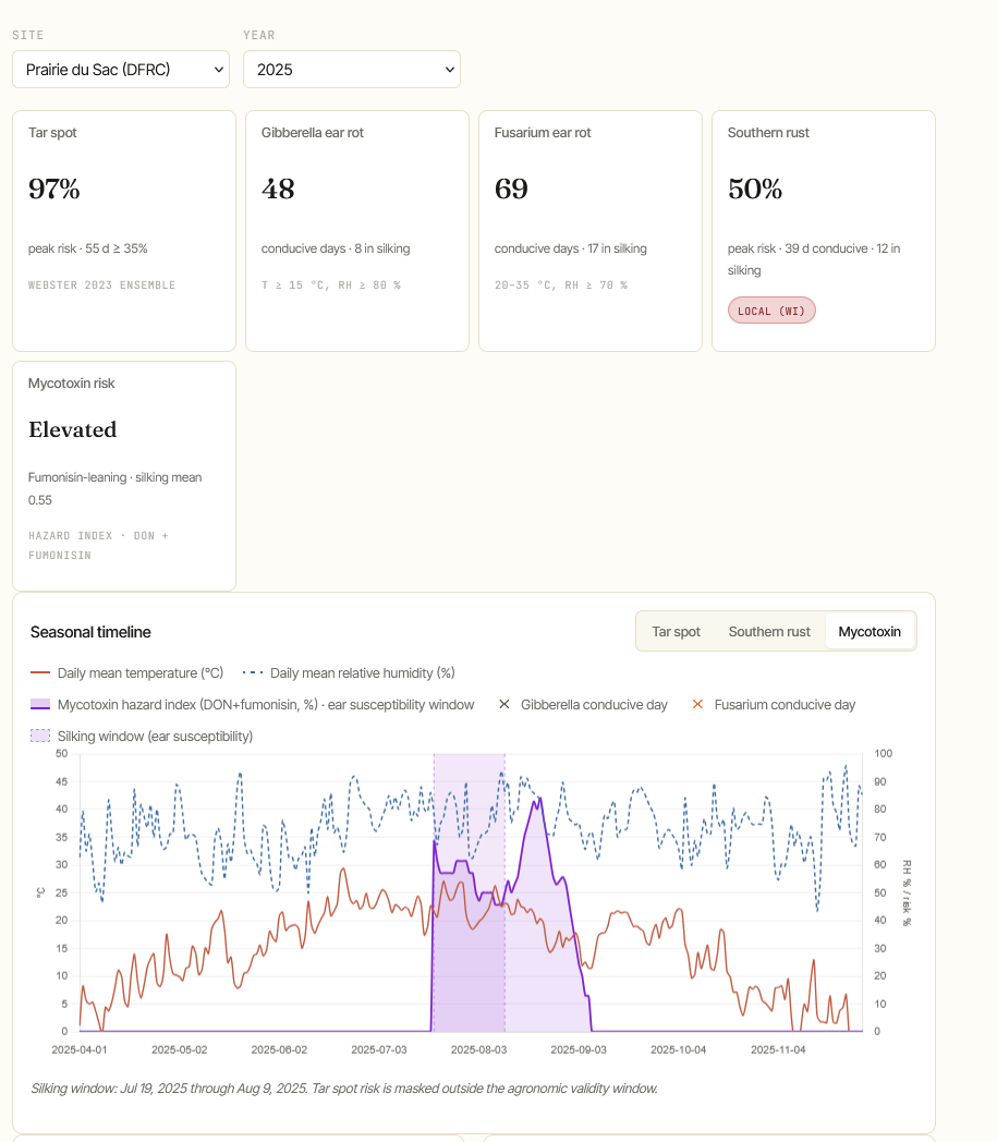
The mycotoxin hazard index is a silking-anchored composite: 60% Gibberella plus 40% Fusarium, computed as a 14-day rolling sum normalized to a [0, 1] score. It’s important that the label is “hazard index,” not “toxin measurement.” A high score means the conditions favored ear-rot infection. It doesn’t mean the corn will fail a feed test. That distinction matters for anyone reading the dashboard.
What I learned building this
A few moments from the build stuck with me more than the others.
Tar spot biology was the first surprise. When I implemented the Wade’s coefficients and saw the model predicting risk on warm-and-humid weeks, I assumed I’d inverted a sign. I went back to the paper, verified, then sat with it. Of course the coefficients are negative for high RH — Phyllachora’s life cycle hinges on leaf wetness duration in moderate-temperature windows, not on overall humidity. That’s exactly what the field epidemiology says when you read it carefully. But I’d internalized “humid = bad” without grounding it in the pathogen biology. Writing the code made me re-read the paper, and re-reading made me actually understand it.
The southern rust threshold loosening was the most uncomfortable revision. I first implemented southern rust with the published optimum-temperature thresholds (25–30 °C, 6 h leaf wetness, RH ≥ 90%) and the 2025 dashboard showed peak risk of about 15% — barely above the noise floor. Then I overlaid my own scouting. I’d walked PdS fields 3300 and 8710 on August 26 and September 5, and found incidence ranging from Low to All-hotspot. The disease was real, the model said it wasn’t. That’s an awkward place to be — your model and your eyes are giving different answers, and one of them has to be wrong. I loosened the temperature range to 22–32 °C and dropped leaf wetness to 4 h. Peak risk jumped to 50% with 39 conducive days, which lines up with what I saw. The point isn’t that the published thresholds are wrong; they describe the optimum, not the boundary. For a binary “is the day conducive” decision, the optimum is too restrictive.
Mycotoxin masking turned into a biology question I hadn’t thought about. My first implementation masked the score outside the silking window — that’s where ear-rot infection happens, so before silking the score is zero by definition. Easy enough. The version that came next masked after silking + 45 days too, since ear susceptibility ends with grain fill. But silage corn often sits in the field into October, and stored silage can still accumulate toxin under conducive conditions. The right fix wasn’t to mask harder — it was to mask less. Drop the upper cutoff entirely and let the 14-day rolling weather naturally taper the score in late autumn when conducive thresholds become unreachable. The biology self-limits without an artificial cap. This was the kind of revision that only made sense after I understood what I was actually trying to model: ambient pressure on ear tissue while ear tissue is present, not a finite susceptibility window with hard edges.
The Open-Meteo timezone bug was the most “this is software” moment. Open-Meteo returns hourly data, and I requested it in local time because that’s what I needed. It worked great for most years. Then 2020 crashed. The cause: November 1, 2020 at 1 AM in the America/Chicago timezone doesn’t exist — that’s when DST falls back. The API returned a NaT (not-a-time) for that hour, which then crashed the daily summary aggregator. The fix is simple — fetch in UTC, convert to local with tz_convert — but I’d never have predicted that as a failure mode. Time zones are software’s perpetual revenge.
The architecture
The whole thing is two pieces. A Python package (corndash) runs the pipeline: fetch weather, compute GDD silking, run each disease model, ingest scouting, write a JSON per site-year. It’s a one-shot pipeline, not a service. It runs once a day via a GitHub Action at 06:00 Central, commits any updated JSON to the repo, and Cloudflare Pages picks up the change and rebuilds the static site. The Astro frontend renders the dashboard from those JSONs — one component file (about 940 lines now) that loads every JSON at build time, renders the five disease cards, the chart, the scouting overlay, and an expandable methods section that pulls thresholds and citations directly from each model’s metadata dict.
The “weather pipeline → JSON → static site” architecture is what made the build feasible for me. I’m not a senior software engineer. I didn’t want to manage a database, an API server, a real-time data refresh layer. JSON files in a Git repo are tractable: I can read them, I can diff them, I can audit them. The CDN serves them. Cloudflare handles deploys. The only real complexity is in the pipeline (which is Python I can debug locally) and the rendering component (which is one file). Pragmatic beats clever when you’re learning the stack as you go.
A few decisions worth recording because they took me time to reach. The index.json file gets rebuilt from disk every run, not appended — that way partial pipeline runs are idempotent. The --planting override only applies to its own year, so a 2025 planting date doesn’t accidentally carry into 2020 GDD computations. The scouting overlay is preserved across runs without --scouting, so the daily GitHub Action can refresh weather without wiping the on-farm observations. Each of these felt obvious in retrospect and was painful when I got it wrong the first time.
The arrivals problem
The southern rust model needs a per-year file telling it when each state first confirmed disease that season. For 2025 I had my own scouting plus extension articles. For 2020-2024 I had nothing, which meant all five of those years defaulted to the “nothing confirmed” lowest tier (modifier 0.05), making historical southern rust risk look artificially mild — even in 2021, which was a strong year nationally.
The Crop Protection Network maintains a crop-lookout-archive online, but the interactive map is JavaScript-rendered and didn’t yield to direct fetching. So I did the next-best thing: pulled first-confirmation dates from contemporaneous extension articles and university announcements. Damon Smith’s Badger Crop Network posts. Iowa State ICM updates. University of Kentucky newsletters. UNL CropWatch videos. I now have eleven primary-sourced dates across the six years, with the rest inferred from regional patterns. The schema flags each state as verified or estimated so I can keep refining over time.
The pattern that emerged validates the historical record. Wisconsin confirmation happened in 2021, 2024, and 2025 (strong years). Wisconsin did not confirm in 2022 or 2023 — which I know from Damon Smith’s 2024 article opening with “a first in a couple of years,” a phrase that only makes sense if neither of the two prior years produced a WI sample. The dashboard now reflects that, and historical southern rust risk for 2021/2024/2025 reads at meaningful levels while 2020/2022/2023 stays appropriately low.
What’s next
A few directions are obvious. Overlaying my actual southern rust scouting on the SR risk curve as markers would give visual validation of the model against ground truth on the dates I was actually in the field. I have 2025 data; I’ll have more years going forward.
Beyond that, more diseases: northern corn leaf blight, gray leaf spot, anthracnose stalk rot, common rust. Each is its own model family with its own published thresholds. Some are temperature-driven, some are humidity-driven, some need leaf area index or growth stage gates I don’t currently compute. The dashboard’s architecture handles new models cheanly — add a Python file, expose a METADATA dict, return a daily score series — so the bottleneck is reading the literature carefully enough to encode each one honestly.
A longer-horizon direction: satellite and hyperspectral imagery to validate model predictions at scale beyond my scouting plots. That’s research, not a weekend project.
What this taught me
Writing my own field down in code makes me a better scientist. Every threshold I encoded forced me to re-read the original paper, sometimes notice things I’d missed, and occasionally find that the published threshold doesn’t match what I see in my own fields. That last category is the one I want to lean into more. Models are summaries. My fields are reality. When the summary disagrees with reality, the summary is what gets revised.
The dashboard is not a research paper. It won’t be cited. But it’s where my reading and my scouting and my code all sit in the same room — and that turns out to be a productive place to work from.